Feadship Employee Brand Guide
This branding guide is for you – to help everyone on the team represent our brand clearly, confidently, and consistently in day-to-day situations.
All external materials carrying the Feadship logo must have a professional and serious appearance. Design is a specialist craft, and so is creating on-brand materials. For that reason, this brand guide doesn’t include guidelines for every possible situation.
This is not a full brand manual, but a practical guide for everyday use. You can download the Feadship logo for appropriate, routine situations. This guide is not intended for designing materials such as invitations, posters, or flyers.
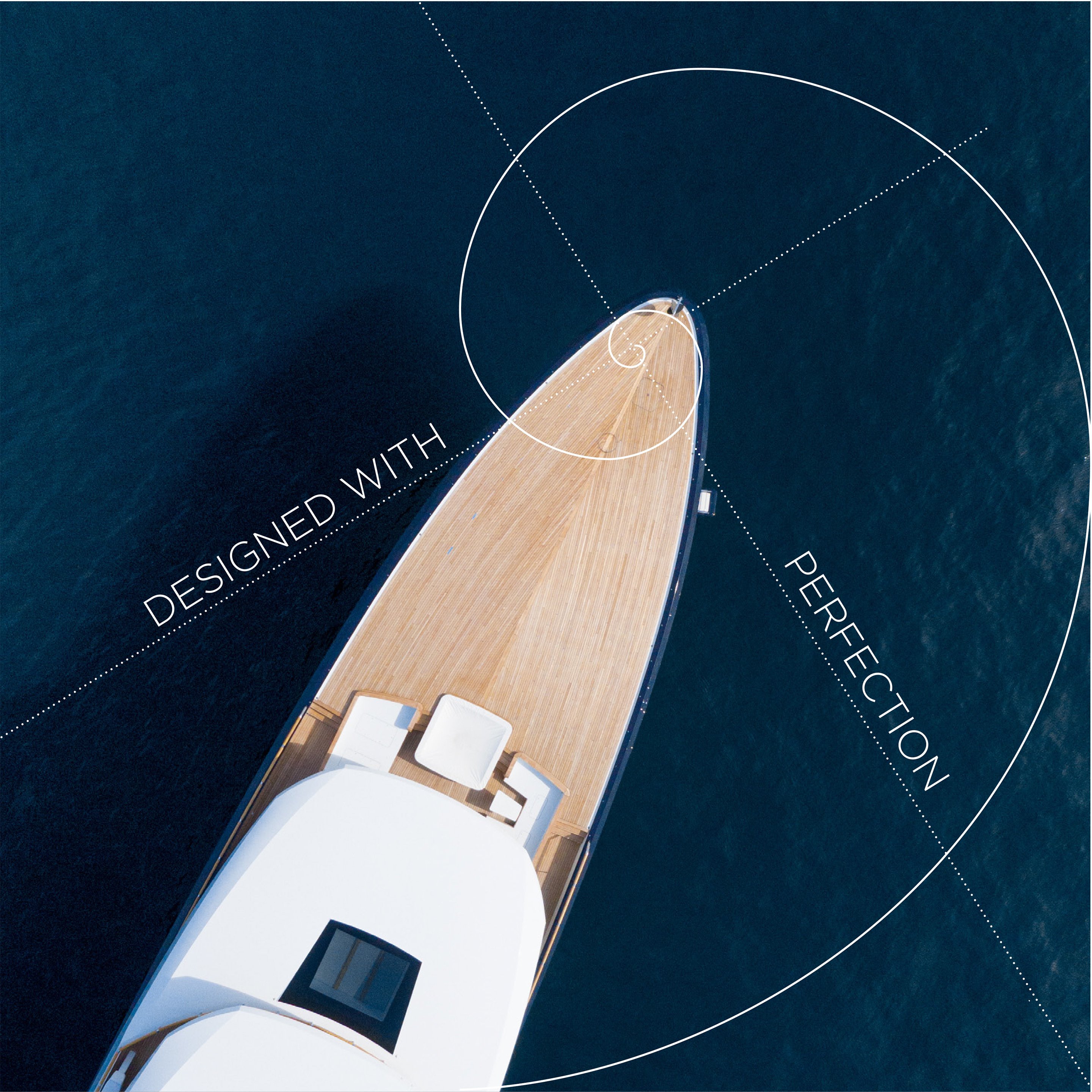
To keep our brand fresh and engaging, we use brand themes alongside the Feadship house style. These themes are updated regularly. For example, during our 75th anniversary, we adopted a vintage aesthetic with a diamond motif. Now that the celebrations have concluded, we’ve introduced a new design theme inspired by the Golden Ratio, a timeless principle of proportion and balance found in nature and classical design. This theme is evolving, with new materials being developed on a regular basis.
To maintain consistency and quality, it is essential that all designs go through Feadship Marketing. This ensures that everything aligns with the current theme and meets our brand standards.
Supporting our colleagues is an important part of what we do. If you need professionally designed materials, please contact the Feadship Marketing department. We handle all design requests and are happy to offer advice as well. Whether it’s a simple invitation or a keel-laying poster, we’ll design it for you and in most cases, you’ll receive it the same day. Our goal is to make things easier for you, so you can focus on what you do best while we handle the design. We are here to help ensure everything that represents Feadship looks and feels as it should.
The Feadship brand
Our brand
We design, engineer, and build unique superyachts of the very, very finest quality and take pride in providing our clients with an unsurpassed experience throughout the design and build process as well as at sea.
Our brand DNA
Just like people, a brand has its own personality – a set of qualities that make it unique. This is what we call our brand DNA. It helps others understand who we are, what we stand for, and what sets us apart.
Our DNA shapes how we communicate, how we treat others, and how we work together. It guides the way we interact with customers, partners, and each other, making sure we’re all representing the brand in a consistent and authentic way.
Knowing our brand DNA helps everyone feel connected to what we do – and helps others feel connected to us. It’s not just what we say, it’s how we show up every day.
Together we build an amazing experience:
- Pure custom creation
- Perfect craftsmanship
- Relentlessly setting the standard
- Dutch honesty
About Feadship
Based in the Netherlands and with roots dating back to 1849, Feadship is a leader in pure custom superyachts. Each Feadship is built with expert craftsmanship and sets the standard in design, engineering, and construction. Feadship also offers resale and refit services to support owners throughout their yacht’s lifecycle.
Feadship × Social Media
We are all proud of the work we do and the yachts we help create – and it’s natural to want to share that pride with others. However, due to the strict privacy commitments we have towards our clients, it’s important that we follow clear guidelines when it comes to social media.
To protect both our clients and our brand, we ask that you carefully follow the rules set out in our Social Media Do’s and Don’ts. These ensure that anything shared publicly respects confidentiality and reflects the brand appropriately.
Download
Social media channels
- Instagram – https://instagram.com/feadship
- Facebook – https://www.facebook.com/Feadship
- Youtube – https://www.youtube.com/@FeadshipNL
- Linkedin – https://www.linkedin.com/company/feadship
- TikTok – https://www.tiktok.com/@feadship_official
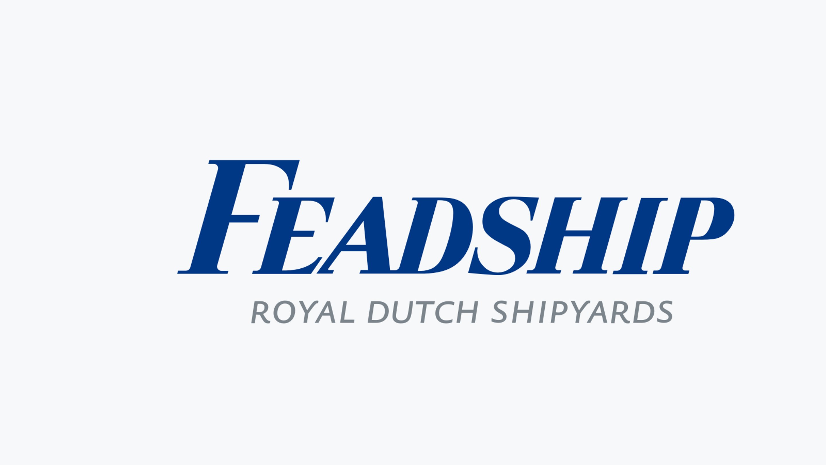
The Feadship logo
The Feadship logo is one of our most valuable assets – it represents who we are and the quality we stand for. It’s essential that we all follow the guidelines in this document to protect and strengthen the image of Feadship. By doing so, we help set our company apart from the competition.
The logo has been carefully designed for maximum visual impact and must not be recreated or altered in any way, including by using other fonts or design elements.
Important to remember:
The Feadship logo must always include its descriptor. Using just the word mark on its own is not allowed – the only place where you’ll see “Feadship” alone is on a Feadship itself!
word mark = FEADSHIP / descriptor = Royal Dutch Shipyards
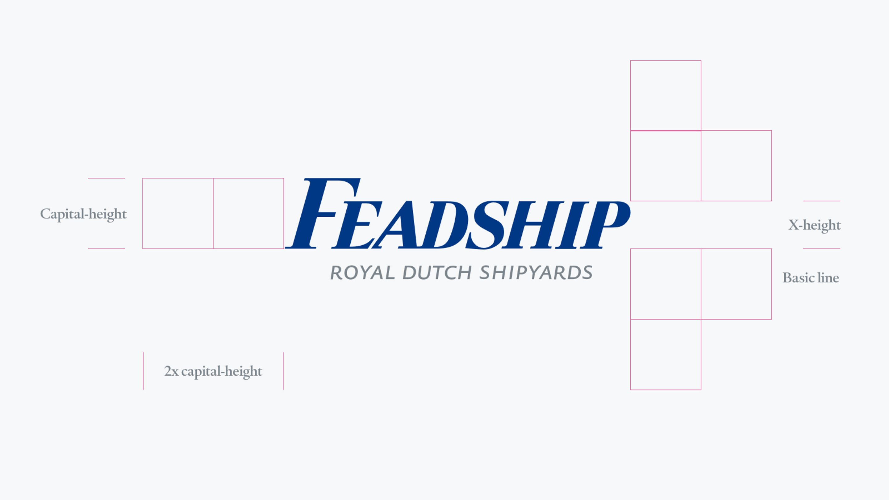
Logo clearance area
To keep the Feadship logo looking its best, it needs enough clear space around it – this is called the clearance area. This space helps the logo stand out and ensures it doesn’t feel crowded by other elements like text, images, or edges of a page or screen.
Here’s the rule:
Keep at least twice the height of the capital letters in the logo (2x the logo’s height) as space around all sides. No other elements – like type, pictures, or borders – should come into that space.
Think of it as giving the logo room to breathe, so it always looks clean, strong, and professional.
Visual representation of the clearance area
Logo background colour
A white background is a key part of the Feadship brand look. Whenever possible, the logo should be placed on a white background – this gives it maximum clarity and helps it stand out.
Only use the logo on a different background if white isn’t an option, and in that case, it should be reversed out (used in white). Ideally, the logo should not be reversed out of any other colour. If you find yourself in a situation where this can’t be avoided, please contact the marketing department before moving forward – we will guide you on the right approach.
Downloads
- Logo Feadship Reflex Blue C 430C White Space eps - 1 MB
- Logo Feadship CMYK eps - 1 MB
- Logo Feadship IT852 430C eps - 1 MB
- Logo Feadship Black eps - 2 MB
F-tag: Decorative use only
In addition to our standard logo, Feadship also has a round icon known as the F-tag. This is not a logo, nor should it ever be used as a replacement for the logo. The F-tag is intended as a decorative element and should be used with care.
Its main purpose is for situations where space is extremely limited and the full Feadship logo simply won’t fit – for example, as a favicon, social media profile image, or similar small-scale applications.
There are two simple versions of the F-tag: one white, and one blue. The context in which you’re using it will generally guide you on which colour is most appropriate.
Always remember: the F-tag is a visual accent, not a substitute for the logo. When in doubt about its use, please check with the marketing department.
Downloads
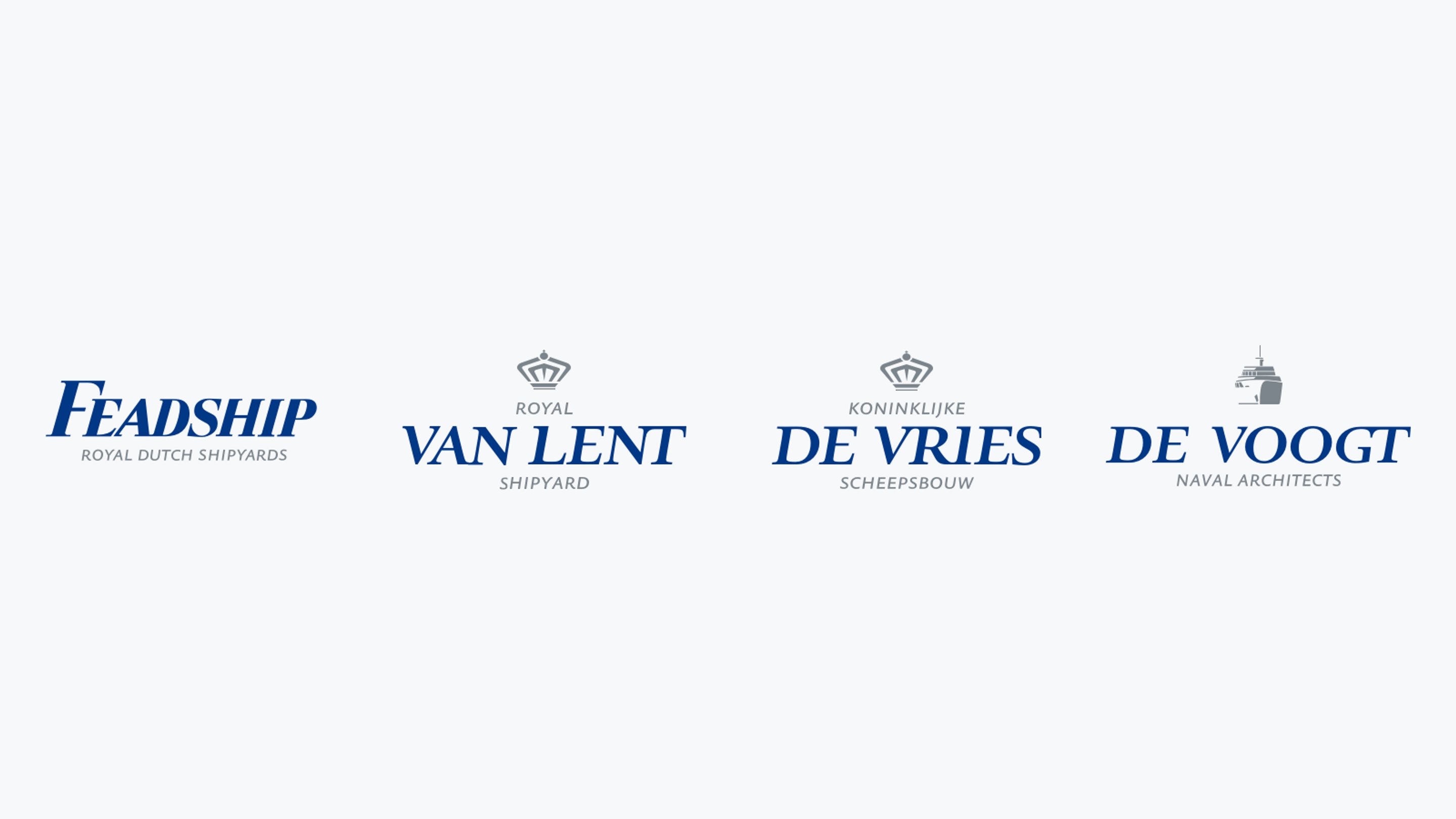
Family logos
The logos of Koninklijke De Vries Scheepsbouw, Royal Van Lent Shipyard, and De Voogt Naval Architects share the same look and feel as the Feadship logo. This ensures a consistent appearance when two of these logos need to appear side by side on the same item.
They also use the same shades of blue and grey, so when printing, you’ll be working with identical colours across all logos – maintaining a unified and professional presentation.
For any questions about placement or printing, feel free to contact the marketing department.
Downloads
- Logo Feadship Reflex Blue C 430C White Space (eps - 1 MB)
- Logo Royal Van Lent Shipyard Reflex Blue C 430C (eps - 1 MB)
- Logo De Vries Scheepsbouw Reflex Blue C 430 C (eps - 1 MB)
- Logo De Voogt ReflexBlueC 430C (eps - 1 MB)
Colours
Primary colours
The primary Feadship colours are Feadship Royal Blue, grey/platinum, and white. Both white and grey/platiunum play a key role in the Feadship brand’s visual identity, while blue is used as an accent colour.
Do not use large areas/surfaces of blue – it should always appear in moderation to maintain the clean and refined look of Feadship materials.
These colour specifications ensure that the distinctive Feadship palette is applied consistently across all materials and platforms.
Print special colours
There are specifications for printing on paper stock. This ensures consistency of the brand colours across different stocks. Feadship applies IT 852, an adapted version of Reflex Blue C. This prevents changes in colour during final finishing, such as laminating or coating.
- IT 852 (Reflex Blue C)
- PMS 430 C
- Platinum (Foil print)
Full colour process (CMYK)
In case only a four-colour process is available use the specified breakdowns:
- Blue: C 100% / M 85% / Y 0% / K 13%
- Grey: C 57% / M 42% / Y 37% / K 4%
Typography
Typography is a fundamental element of the Feadship brand identity. When used alongside our brand colours, it forms a powerful and consistent visual language. Its primary role is to ensure that our communications are clear, legible, and accessible across all platforms.
Feadship’s typographic system includes a primary and a secondary typeface. The primary typeface is reserved exclusively for professional use by the marketing team, and approved suppliers. It is used in official brand materials such as brochures, advertising, and the website, and must be applied in strict accordance within the guidelines. For more information about the primary fonts, contact the marketing department.
Our secondary typeface is Arial, available on all PCs and Macs. It is used for day-to-day communications including letters, emails, presentations, and internal documents. Please note that Microsoft Office now automatically sets Aptos (previously Calibri) as the default font in many applications. Ensure that Arial is manually selected and set as the standard font across all documents and templates.